
Every Friday, I’m compiling a list of five things that meet one criterion. “What is that criterion,” you ask? Well, it’s going to change every week and you’re just going to have to try and keep up.
This week…
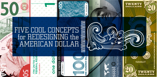
Five Cool Concepts for Redesigning the American Dollar
Let’s be honest: the American economy is still in need of some help. Maybe in the form of a soda tax, maybe in the form of financial regulation, maybe some awesome other thing nobody has even considered (years from now, you’ll remember me as the person who once wisely suggested selling the military supersoldier serum to eliminate the federal deficit).
But on a purely superficial level, I think there’s a clear way to get this wagon train moving: redesign the American dollar. Let’s be honest, if money wasn’t money, nobody would want it; it has a boring color scheme, it’s flimsy, it’s pretty cheap-looking, and most of it is smelly and covered in germs.
While I don’t know if anyone anywhere can design anything that would remedy the odor/germ issues, I do know that the stale look of America’s currency (it’s largely been the exact same since the Great Depression) should change. And so does Richard Smith, the man who organized the Dollar ReDe$ign Project in the hopes of re-branding and re-stimulating the US Dollar and the economy supported by it (plus, Europe is routinely putting us to shame in this department).
The Project has received countless wonderful submissions from designers around the world and the world at large should start to recognize some of the best, which I have taken the courtesy of highlighting below.
—
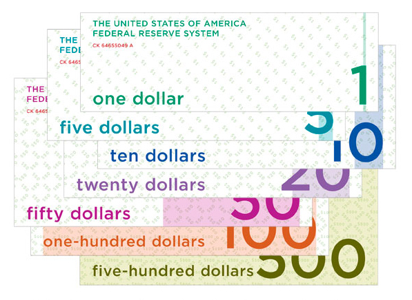
Design by Margaret Park
While all the other entries on this list are image-heavy, it’s tough not to admire the simplicity of this design. It’s a little vintage and contemporary at the same time; like you could see it being used in the 50s when everyone was excited about everything being made of chrome and colorful plastic but it would also work perfectly in some deleted scene from Avatar. The inclusion of the phrase “Federal Reserve System” is wise, as it really should be mandatory on all currency concepts, moving forward (either that or “Symbolic, Mutually Shared Illusion”).
—
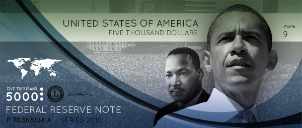
Design by Jan Michael Guzman
While the idea of putting Barack Obama on our currency before the end of the man’s first term is a little ridiculous (let’s play it safe and just expand Mount Rushmore, I say), Guzman’s familiar-yet-futuristic work is just beautiful. Looking like a page out of an American history book from Epcot Center while retaining all the current hallmarks of our bills (the Secretary of the Treasury’s signature, the serial numbers, and the Federal Reserve bank seal), I would love it if blue became the new green.
—
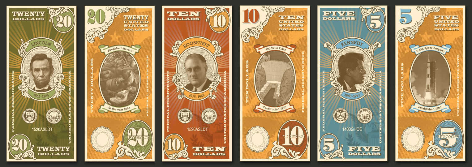
Design by Chris Collins
A really cool integration of nostalgic design (very circus poster-ish, souvenir baseball program-look) and historical photographs of America’s most influential Presidents mirrored by images of their greatest accomplishments. Oh, and it’s vertically oriented! Edgy! And don’t tell me you didn’t instantly fall in love with that John F. Kennedy $5 note – I would hesitate to spend it. Anything involving spaceships should be fast-tracked through Congress.
—
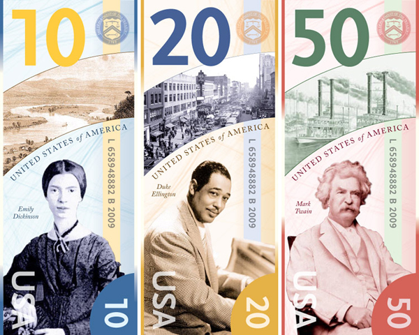
Design by Dean Potter
Another vertically oriented idea that uniquely abandons the standard of emblazoning currency with mostly political figures (I know Ben Franklin did not ever serve as President, calm down). Potter did not leave recognizable faces like Washington, Lincoln, or Jackson off of his designs by accident, either; he proudly points out that “we’re a culture, not just a government”. Great American figures that are identified with the arts or society in ways that have nothing to do with elected office routinely make their way onto stamps and into classrooms but have somehow been dually disregarded when it comes to our currency – once you realize it, it really does seem askew.
We should applaud Potter for pointing this out and aiming to change it. The smaller complimentary images near the top of the bill follow this untraditional pattern, featuring landscapes and locations that are just as relevant to our country’s past, present, and future as the large monuments in Washington, D.C.
—
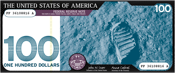
Design by Nate Castiglione
Though I don’t believe anyone would argue that one American event should be portrayed across all bills, Castiglione’s Space Race design is easily the most dynamic and bold of any featured on this list. In addition to having the notes dominated by photographs (pretty tough to envision but imagine how cool it would be if you took a picture that eventually ended up as a dollar bill?), he specifically made a point to incorporate distinct rounded edges, large and clear print, and a variety of colors to aid the blind and visually impaired. And look, I’ll just admit it: the asymmetrical black framing reminds me of Star Wars and I am biologically predisposed to support such a reference, whether it’s intentional or not.