
Be honest: How many of your furniture or decor pieces are black, charcoal, or — if you were feeling adventurous when you placed that IKEA order — navy blue or red? Does your decor include any textures more adventurous than MDF, plastic, or a synthetic fabric you couldn’t name?
Walk into almost any young bachelor’s pad, and it’s clear that few guys know how to confidently use color, or multiple textures, in their home. Maybe it’s due to an outdated idea that colors like black, charcoal, navy blue and red are stereotypically “masculine” colors — or an understandable human propensity to buy only the cheapest decor — but most likely it’s because many guys never gave much thought about how to use other hues or textures until they got a place of their own.
Whatever the reason, when it comes time to upgrade their spaces into homes they can be proud of and feel comfortable in, many guys are stumped on how to create a masculine aesthetic that utilizes a broader color palette and a richer, more diverse range of textures.
The good news is, adding color and texture into your decor is an easy way to maximize your home’s style with minimal effort — and you don’t need an interior design degree to do it well.
Expand Your Color Universe
Allow me to introduce you to some simple concepts for color selection to help you nail your color palette every time. Follow one or all of these basic rules to achieve your ideal sophisticated, modern gentleman’s home.
Jewel Tones
Almost without fail, guys can comfortably fold “jewel tone” colors into their home decor, and it will still look classically stylish and masculine.
What are jewel tones? Jewel tones are richer and deeper than primary colors, but still look vibrant and glowing. Think amethyst, sapphire, emerald, citrine, and onyx. If it’s a gemstone, it’s also a jewel tone.
If you’re struggling to imagine the difference between jewel tones and primary colors, picture this: It’s the color difference between the vibrant, warm red of a ruby ring you might give your girlfriend, and the harsh, shallow red of a Little Tikes fire truck.
Or, how about this: When considering a new color for your space, ask yourself, “Could this color also be the color of a Power Ranger suit?”
If the answer is yes, it’s probably a primary color, and it’s not a furniture piece or accessory you want to bring into your mature, cosmopolitan home.
Instead, Google the gemstone equivalent of that color, (“blue gemstone color” yields “sapphire,” for example) and search for your desired decor piece in that color, instead.
Here are a few examples of masculine spaces that incorporated “jewel tones” well:
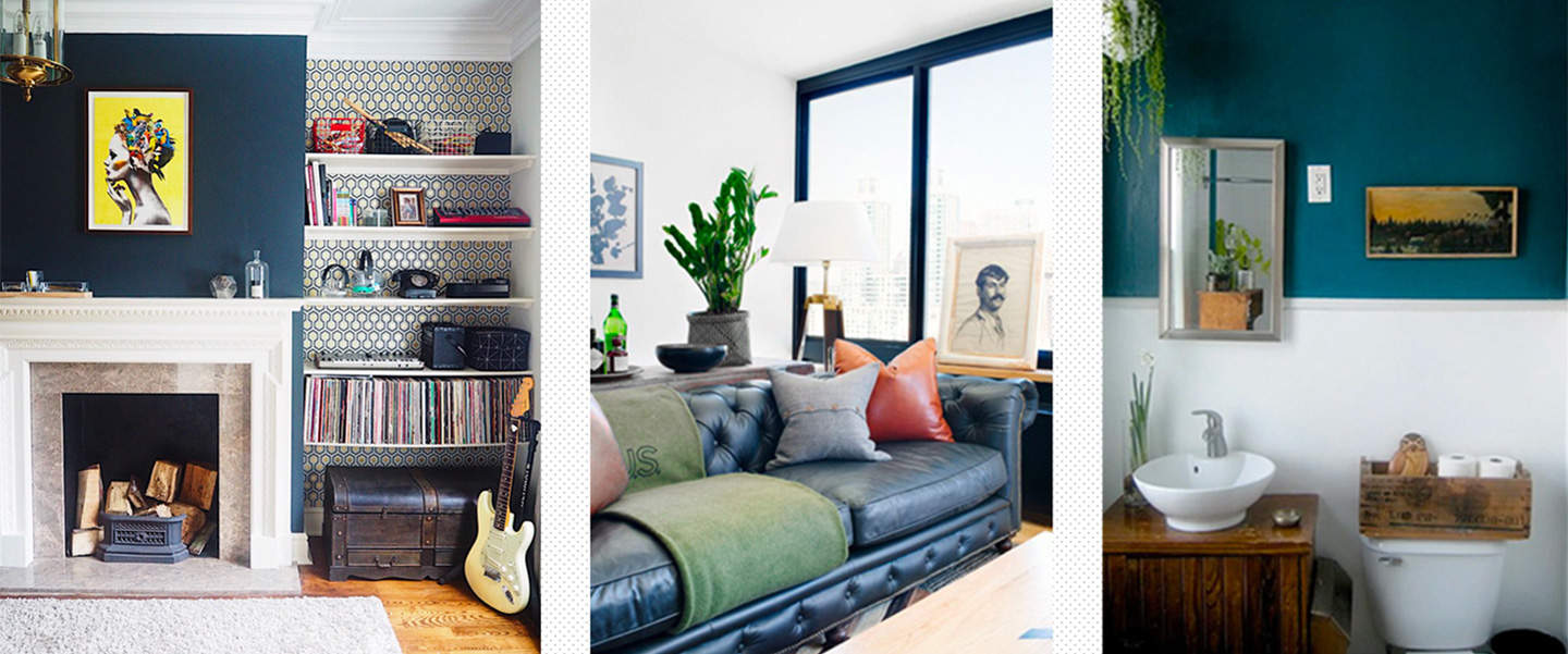
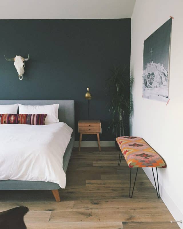
Emerald Green
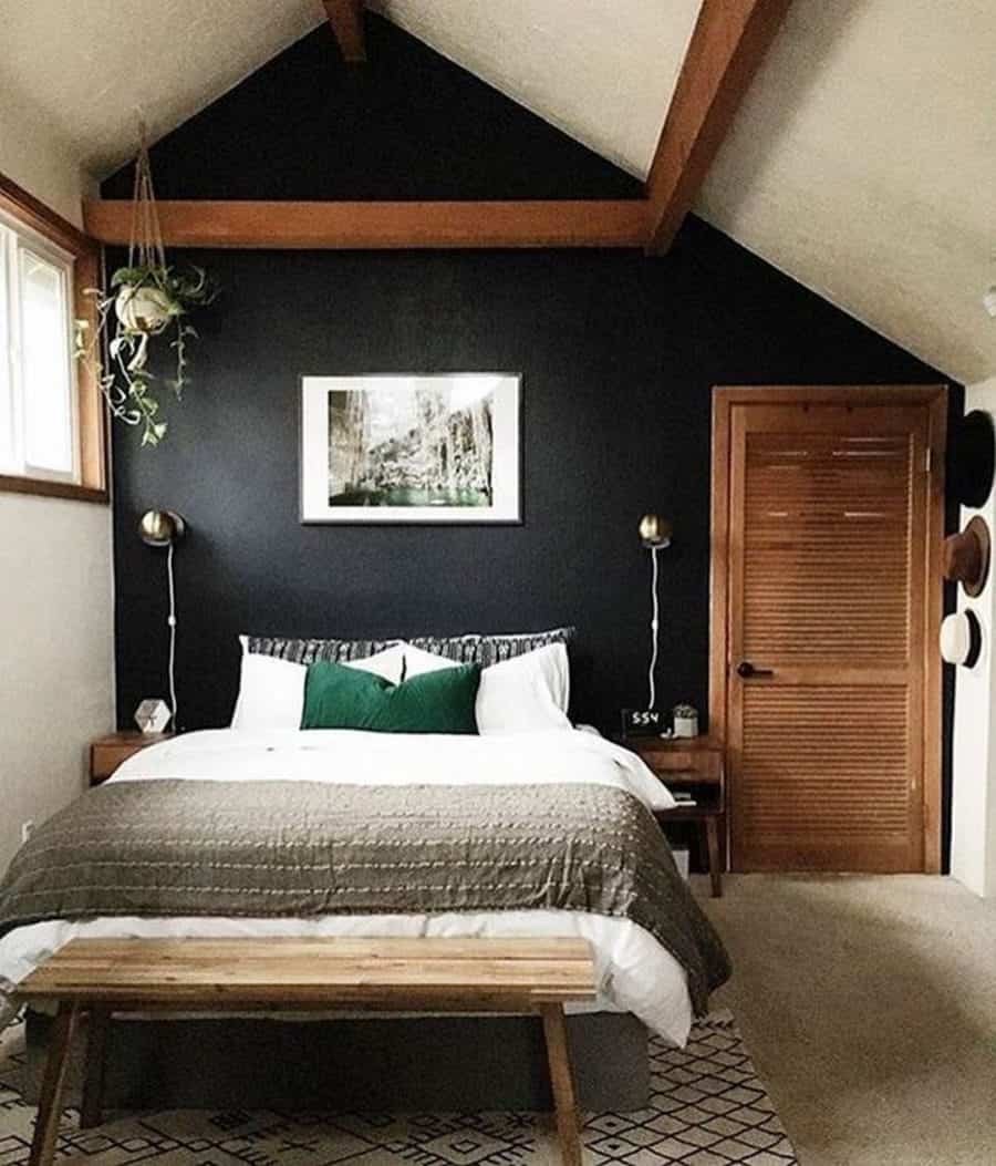
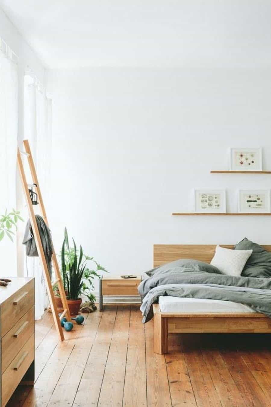
By adding two pops of emerald green (check out the pillow and the plant) to an otherwise white, black, grey and navy blue color scheme, this bedroom becomes more visually interesting. You don’t have to paint an entire wall, or buy a big green carpet — just add two simple hints of a jewel tone.
Citrine and Ruby
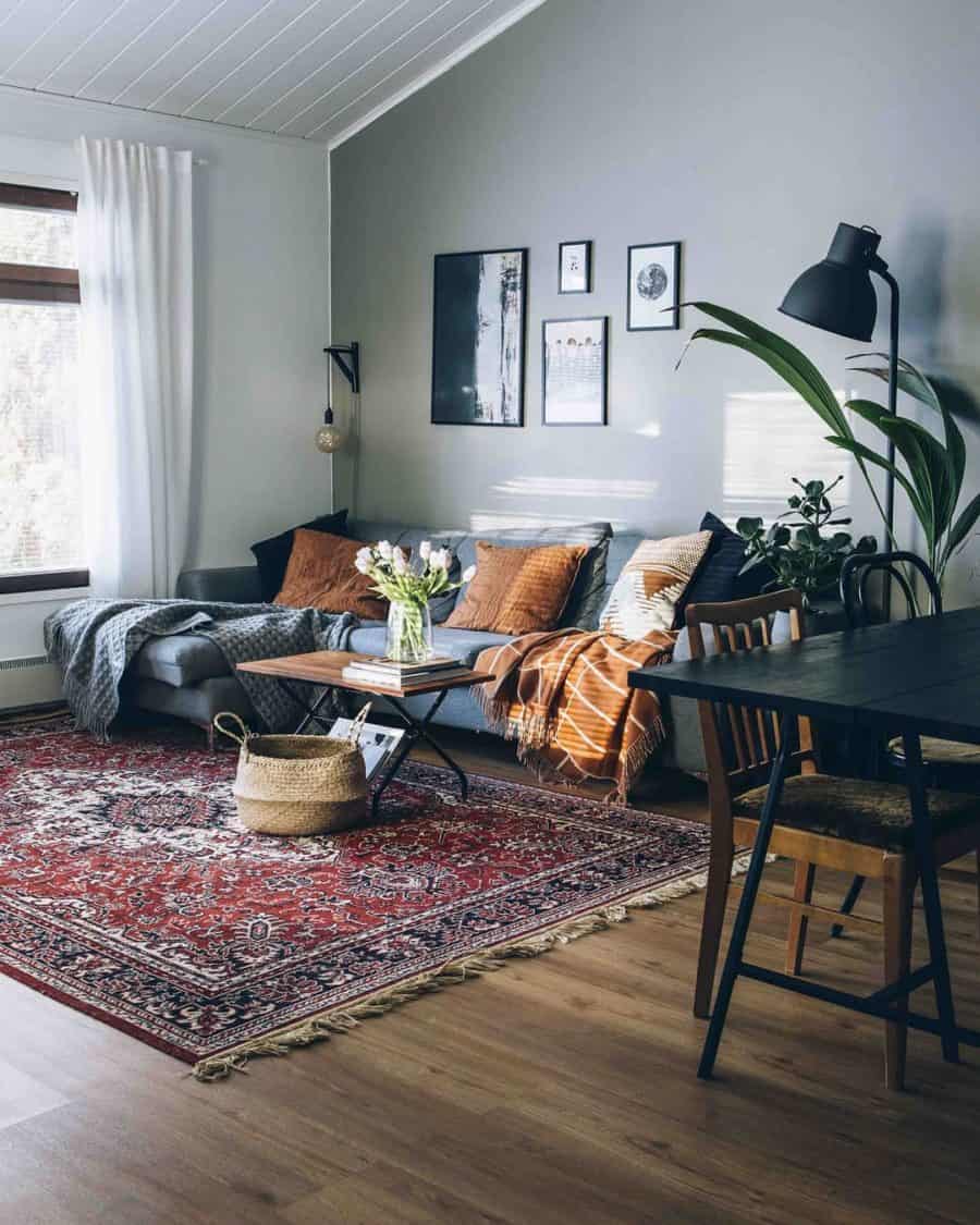
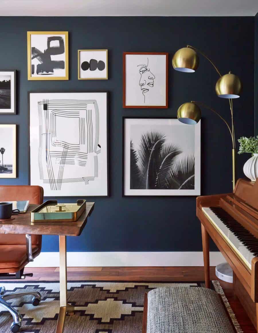
Note the dark citrine yellow blanket and pillows for the couch and the ruby red details in the rug.
Deep Turquoise
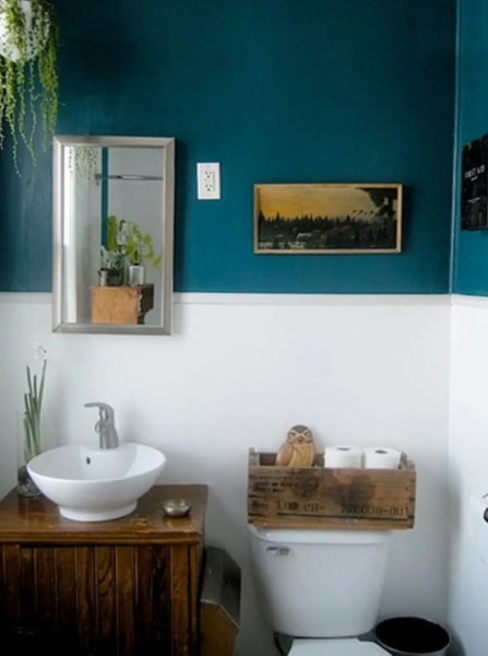
A deep teal or turquoise contrasts well against woods that have gold or reddish undertones, like pine and cedar.
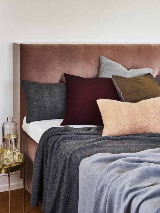
Dusty Colors
Using dusty colors is another excellent way to bring new shades of the rainbow into your home, albeit in a more muted manner. Some examples of dusty colors are rich ochre (golden yellow), sage and olive green, dusty mauve, and stormy blue; these can also be used as complementary colors to jewel tones.
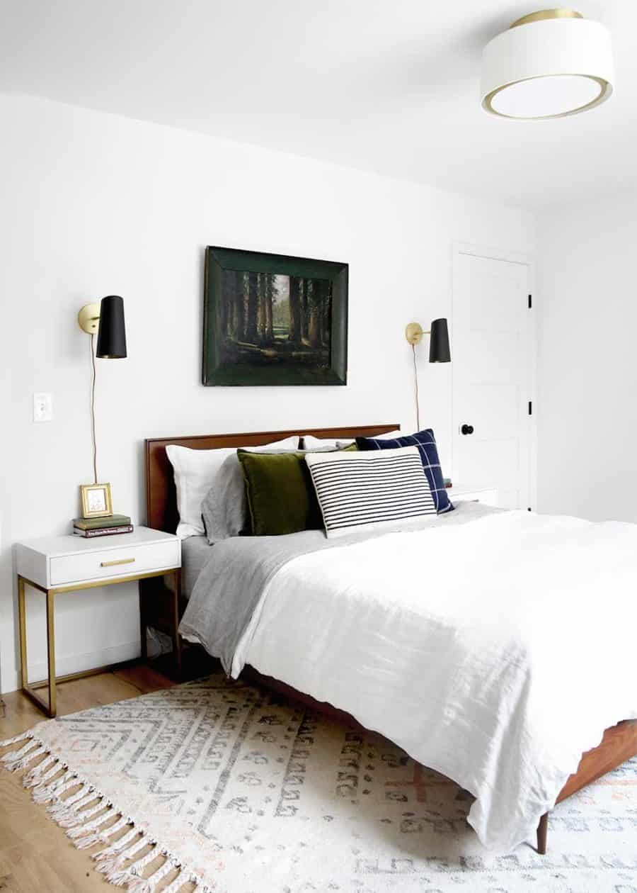
This olive green pillow contrasts well with the richness of the blue pillow and the emerald green picture frame, and stands out against the grey and white linens.
Dusty colors are especially appropriate for the bedroom, where calmer, gentler colors lend themselves well to creating a classy, zen resting space.
A dusty blue bed frame with weathered pinks, oranges, greens, and yellows contrasts well against a dramatic navy blue wall.
Dark charcoal and light heather grey look more visually interesting juxtaposed against a ruby red cushion that’s nestled in with light dusty orange and weathered army green pillows.
Dusty colors add a calming element, and jewel tones add vibrancy without appearing immature.
What’s more, you still have other tools to broaden your home’s color palette and visual appeal.
Don’t Forget About Texture
Exploring colors is great, but if the materials that make up the furniture and accessories in your decor are just variations of cheap materials like plastic, synthetic fabric blends, and MDF, your home will still be missing the visual interest that varied textures can introduce into a space, and your new colors will fall flat.
Try using some or all of these textural elements in your space.
Metals
Brass, copper, silver, chrome, gold, aged iron — not only does metal add another layer of depth to your decor, it also adds a sense of substance and weight to a room.
Depending on your desired style, different metals can work best. For example:
Iron
Elements and fixtures in iron look great with industrial-inspired decor. Experiment with different patinas (how aged or weathered the metal looks), too.
Copper
This warm, gently glowing metal works well for an eclectic, boho aesthetic.
Brass
A neutral golden tone that lends itself well to recreating that Mad Men, mid-century modern look.
These are just a few examples, but don’t be afraid to mix it up and include more metal in your decor. If you feel like your space could use some “heft,” try incorporating metal elements through decor pieces like a floor or desk lamp, a coffee table with metal legs, or metal bookshelves.
Wood and Plants
Natural wood elements and plants, both live and faux, add warmth and dimension to your space — not to mention color.
In this bedroom, notice the different elements of dusty colors (the grey duvet and blanket), warm, aged woods, and plants that double as an interesting texture and a jewel tone (emerald green).
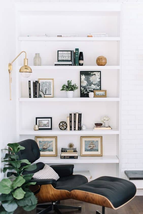
Note the bright gold light fixture, the faux plants, a pop of sapphire (a jewel tone) brought in with a well-placed book, and the wood accent on the lounge chair. It’s mixing metal, plants, a jewel tone, and some wood accent pieces, all in one cozy, stylish nook.
Leather and Other Fabrics
Lastly, let’s cover leather and fabrics. Think of everything that comprises the objects in your home, like your furniture, window curtains, area rugs, shower curtain, lamp shades, kitchenware, and other decor.
The materials your furniture and accessories are made up of affect your space’s overall aesthetic. Materials are often the difference between having a home that looks visually interesting and sophisticated, and a home that looks like your college dorm room.
Switch your MDF to metal and real wood; synthetic fabric blends to velvet, linen and leather; plastic to glass, ceramic and stoneware, etc.
Making this transition can be costly, as products made with higher-quality materials are often more expensive, so take your time to make the switch wherever you can. Remember that thrift stores, Facebook Marketplace, and your local Buy Nothing groups can be some of the best ways to score a deal.
Take it one piece at a time — perhaps focus on big-impact pieces first, like switching out your curtains for a better fabric, or keeping your eyes open for a classier media console.
Let your friends and family know what you’re searching for, too. You never know who has an amazing but unused piece of furniture simply sitting in their garage; they might be happy to part with it for free or at a budget-friendly price.
If this sounds overwhelming, remember that you’re not throwing out everything you own all at once. You can focus on one room or even one nook at a time, like your bed and the surrounding space. Make gradual swaps — a new side table here, an art print or plant there — until you’re happy with the look.


![No, Timeless Style Is Not a Made Up Marketing Term [Essay]](https://www.primermagazine.com/wp-content/uploads/2023/05/timeless-style_feature.jpg)